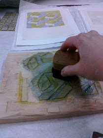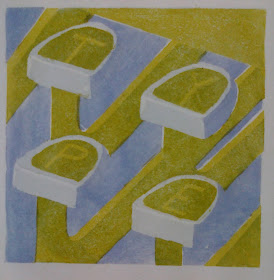
I struggled with the decision to add more ink to the 'keys'. I had put one coat of blue over the yellow, which created the letters. But after it dried, it was lighter than I wanted and the letters didn't show very well. I eventually came to the realization that it's the letters that matter most! So, I had to try. I was concerned because I was going to have to have perfect registration to line up with the letters that were already there. And we all know how I struggle with registration.
I was so thrilled when I pulled the first print and it had lined up great and the letters just popped out. What a relief! It really did look alot better now, too.
But, I couldn't relax because each and every print had to be lined up perfectly. It's not easy because the print goes face down onto the plate. You don't know what you'll get till it's all over and you pull the paper up. That's why printmaking is such a thrill! It's exciting every time you pull a good print. I think it's also addicting, that thrill of achievement.

I still have one more color, a dark blue, before I can relax and say they are done.
I didn't have the traditional type of paper used to cover the back of the print when rubbing with the baren. I thought I'd use wax paper, but I didn't have any. I did have some parchment paper in the kitchen. So, I tried that. It worked better than anything else I've tried.
I'm going to set this project aside until next Monday. See you then!

I totally identify with everything you've said here! And I agree that parchment paper works better than anything else. The print is looking good.
ReplyDeleteI've found parchment paper works great too. You're so brave to line up all those colors!
ReplyDelete