Tuesday, March 30, 2010

YEAR OF THE TIGER PRINTED

Yahoo!  I persevered and got the printing done in one session on my Year of the Tiger print for BarenForum's annual Exchange.  It was originally going to have two colors on it, but I didn't like the way it looked, so went with just black.  I'll probably try hand coloring a few to see how they look.
I had the papers already cut and ready to go, there is quite a stack.  I can't remember how many exactly, probably about 60.  
It's Akua ink on a printmaking paper I picked up on Daniel Smith's Sale table - No Name.  The paper is cut 5" by 6".  I carved the image on a piece of Poplar and printed them using my Ettan Etching press.  Just the printing part took about two to two-and-a-half hours, with probably another hour testing and rejecting and setting things up.


Pretty good for one day....but I wanted to see how it would work to print on fabric.  So.... I cut some thin white cotton and printed on that.  It turned out really great!  Just like the paper, it was pretty clean and crisp. That encouraged me to try it on canvas.  I cut and ironed some raw canvas I had on hand  and printed nine lucky tigers.  Kind of Andy Warhol-ish.  Pretty cool!
This has given me some ideas for a project tomorrow!

Friday, March 19, 2010

MORE ROCKING FUN

I was in Borders bookstore the other night, just browsing and came across an interesting book.  It's called Image Transfer Workshop by McElroy and Wilson  I just had to buy it!  It contains a bunch of different ways to transfer images into your artwork.  
I read most of it that evening.  There was one process that really intrigued me.  The next morning, after a trip to Daniel Smith for some needed supplies, and stopping to get some copies made at Staples, I was all fired up and went up to the studio.

This process is basically a paper plate lithography method.
  
After saturating the copy with Gum Arabic, you roll ink onto it then wipe it off, and run it through the press.

I'm transferring the image to fabric, by the way!


There first one wasn't very good, it had wrinkles in it.  The wrinkles aren't in the print, the were on the plate, so they transferred to the flat image.  It's an interesting effect, but it's not what I'm after today.
So, from then on I was more careful about adhering the copy to the acrylic plate I was using.  Here are a few of the others I made that day:


I'm really pleased with the results.  My only worry at this point is how long will it take the oil paint to dry!?
I'm planning to try different inks.  I would really like to try Akua.  They are not oil paints, so I don't know if they will even work or not.  But I love their inks and use them with my printmaking.
I'm not really familiar with lithography and don't understand the concept, so it's difficult for me to think beyond the basic instructions in the book and understand why something works and why it doesn't.  You know what I mean?
I've got some very talented and knowledgeable friends online. 
I'll have to pick their brains.

Please leave a comment, I would love to have some opinions. 

Monday, March 15, 2010

ON THE ROCKY ROAD

I've been inspired...

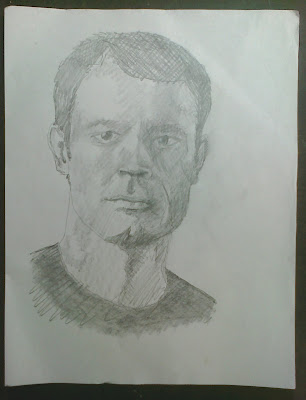
First I did this pencil drawing above with plans to do something in fabric eventually.  This drawing was really just to help me figure out the darks and lights placement.

Then I put the outlines of the dark areas on a piece of white cotton.  I thought I was going to use the sewing machine to make the portrait with thread.  But, I began to doubt I was talented enough to do that.
So, maybe if I painted the lights and darks in, then when I put the thread lines in their placement wouldn't be as important if it was just a white and thread picture.
I soaked the fabric in water and spread it out on my formica board and started painting with my acrylic paints with GAC 900 added.  I was having so much fun, and it was going very well.  I got carried away.  It ended up being more than just a suggestion of a portrait!
After I was done, I started dropping paint drips and splatters on it.  I don't know...

When I hung it up to dry, there was a ghost image left on the board from the paint that had soaked through.  I quickly grabbed a piece of paper and placed it on the paint and used a brayer to transfer the paint.  There are two images because I added more paint to the fabric portrait and took a second transfer image after that session.  I don't have a plan for this, but it's interesting:
Then, more fun.  I took some photocopies of the same image and randomly cut them up then arranged the pieces.  Here are two of the fractured portraits:
 I don't know what I'll do with these, but they were very fun to make.

Monday, March 08, 2010

SNITZEL CHANGE

In my last post I showed how the 'Lines' Snitzel looked after I had attached the pieces to the background using acrylic medium with GAC 900 added.  It wasn't dry yet so the colors looked completely different.  I wasn't sure it would dry looking like that, but fortunately it didn't.  When the acrylic had dried and I ironed it to set it, the colors were very close to the original look.

Here's the first photo I took of it:


And here is the photo I took after I added more lines around the eye on the left and adhered the pieces to the background.  They are more or less permanently affixed now:
The colors are very similar.  I think the only difference is in the lighting or exposure of the different photos.

I really think adding the additional lines to the left eye helps it alot.  I'm not sure where I'm going with it next.  I'm still letting it simmer.

Thursday, March 04, 2010

SNITZEL FIXIN'

I needed to make some changes to a couple of my Snitzels - 

Yesterday I painted the green fabric, that was too bluish, with an overall wash of Cad Yellow Acrylic with GAC900 added, to the top one.  The bottom one  is how it looks today, with the lines zigzagged on.


It's definitely an improvement.


The next one I worked on is the Eyes.  I thought it needed lines added to the 'eye' on the left.  And as an experiment to see how it comes out I mixed some Matte Medium with a little water and some GAC900 to use as an adhesive to hold the batiks onto the canvas backing.  I needed to put medium on the back of the fabric also when it started to bubble up.  This made the black background show through, especially on the 'flesh' colored fabric.  I'm hoping it won't be so obvious when it completely dries.  I won't know until tomorrow.


The one on the top is the way it looked before...the one on the bottom is after I changed it.  I do like the added lines to the 'eye', but I'm worried about losing the fabric color, I think some of it is the lighting I took the pictures under, too.  I still might be able to fix it.  Remember - this is an experiment.  It's a learning process!


Wednesday, March 03, 2010

WRONG KIND OF PAINTING


Got a coat of primer yesterday and a coat of paint on the Fabric Case today.  Needs one more coat of white, and then I'm going to push it into it's corner and wait for the husband to install the hardware for the baskets.

Boring!               Turn the music up!

Monday, March 01, 2010

YEAR OF THE TIGER STARTED

I flipped over the plank of Poplar I used on the last print I carved and started afresh on the back of it.  There is room for all three of the blocks I need for this print.
I had tried to transfer the drawings before using photocopies.  It didn't work, the image didn't transfer.
This time I used print outs from my HP copier at home and it transferred just as it's supposed to.  Yeah!


I used diluted rice paste to glue the papers face down to the plank.  When it was good and dry, several days later, in fact, I moistened the paper and it just rolled right off leaving behind a beautiful reversed image.  Yeah!


 It left a very crisp and usable image.  Now I just have to start carving.

Hmmm...I can't remember if I sharpened my tools after I used them last time.  I sure hope so!