Tuesday, January 26, 2010

SNITZELS - LINE DRAWINGS

In class we were asked to close our eyes and draw with a pencil on paper for several minutes with our non-dominate hand.  I was thinking about filling the whole paper.  I would feel the edges and try to draw right up to the edges.  I also was thinking about drawing eyes.  I was surprised when I opened my eyes and looked at what I had drawn.  I didn't fill the whole paper like I thought!  But, I really liked the flow of the line and the overall look and 'feel' of it.
Then, we were asked to flip the page over, close our eyes and draw again.    After we opened our eyes.  I picked out an element I liked and repeated it randomly over the page.

From these two drawings, our assignment is to make some snitzels for next week's class.

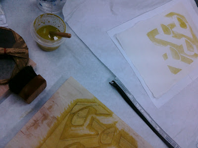
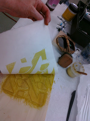
I took a 2-1/2" window and moved it around until I found areas I thought interesting.  Using tracing paper I traced the area.  I discovered that I needed to eliminate some of the lines and boil it down to the basics of what made it interesting. 

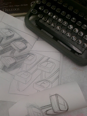
This one is my favorite.  I thought this section looked like a face.  After the first tracing I realized I needed to leave out a lot of the lines because it was too confusing.  I put back in a few of the non-essential lines to add interest.
I can hardly wait to get started on this one.


From the same original drawing, I wanted to make one of the 'eyes'  This was the most interesting and defined.  I left out some of the unnecessary lines.  
It doesn't look as much like an eye as I thought...in fact it looks like a chicken.  So.....


I altered it a little bit to make it look more like a chicken.  I don't know.... I don't do paintings of chickens!

I should give it a try though.


This will be the last snitzel I do, if I have time.  


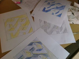
From the 'Map' drawing, I found four little sections that I like:


This last on is my favorite of these.  I'm very excited to begin. This is the one I will do first, since it's a little easier than the face.


Here we go!

The next step is to translate these drawings into snitzels.   Stay tuned.

Thursday, January 21, 2010

SNITZELS - SPACE

Our assignment is to create some Snitzels  that demonstrate the concepts we talked about in class about space and perspective.  I definitely wanted to do one about perspective.  
I came up with a simple drawing of boxes, showing two-point perspective.
I pulled out my solid-colored fabrics and sorted them into color families, trying to find light, medium and dark of colors that worked together.  It's always the fabric that holds me back!  (And I thought I had a HUGE fabric stash!).  I quickly realized that for most of the boxes I only need two colors.  That made it so much easier!

Here's my first rendition:  After I got the boxes up, I noticed the 'hole'.  It was to small for another box, so I'll try sticking a sphere there or something.


I'm using a photo of raindrops on a camera lens cover to make this next one.  I found it very difficult to made a gradation from dark to light.  In real life, the gradation is gradual.  It's hard to do that with just fabric.  On a few of them I tried shading the fabric with a colored pencil.  Is that cheating?  It worked well, but will it stay on there in the long run?  Will it fade or discolor?  Who knows.

I've got a long ways to go on this one.  It will go to class pretty much like this though.  We'll see what everyone thinks.

Wednesday, January 20, 2010

EXCHANGE 43 FINISHED


I've got it done! Can't say I'm really happy with the edition. There are a lot of goobers. I'm just amazed that I don't see them at the time of printing. At least not all of them. I do see and correct a lot of mistakes, but they still get through. It seems you never make the mistakes on the already bad ones, just the so-far-so-good ones. My apologies to the other members of the exchange.

Oh, the joys of printmaking!

I will be putting these into the mail soon.


Thursday, January 14, 2010

EXCHANGE 43 RE-DO

I struggled with the decision to add more ink to the 'keys'. I had put one coat of blue over the yellow, which created the letters. But after it dried, it was lighter than I wanted and the letters didn't show very well. I eventually came to the realization that it's the letters that matter most! So, I had to try. I was concerned because I was going to have to have perfect registration to line up with the letters that were already there. And we all know how I struggle with registration.

I was so thrilled when I pulled the first print and it had lined up great and the letters just popped out. What a relief! It really did look alot better now, too.

But, I couldn't relax because each and every print had to be lined up perfectly. It's not easy because the print goes face down onto the plate. You don't know what you'll get till it's all over and you pull the paper up. That's why printmaking is such a thrill! It's exciting every time you pull a good print. I think it's also addicting, that thrill of achievement.

I still have one more color, a dark blue, before I can relax and say they are done.

I didn't have the traditional type of paper used to cover the back of the print when rubbing with the baren. I thought I'd use wax paper, but I didn't have any. I did have some parchment paper in the kitchen. So, I tried that. It worked better than anything else I've tried.

I've got to remember the things I've learned this time!


I'm going to set this project aside until next Monday. See you then!

Sunday, January 10, 2010

THIRD COLOR EXCHANGE 43

Here it is Sunday, supposed to be a day my husband and I go play, and I'm working on my print! But, I want to get it done, and the paper is damp, I've heard horror stories about mold from keeping the paper damp for too long.

This is the third color applied. I cut down the block I was using yesterday. So, you could call it a reduction cut. This color is a medium value blue-violet for the background.

Putting a different value on really helps the image to start to come together.


After all the papers were inked with the new color, then I cut away more of the block for the final color. I've got myself kind of messed up, so I'll be going back to the first plate (the one I used for the yellow) and printing over the letters again because I don't think they show up well enough. This is not the block I used to print the letters in the first place. But, since I cut away the lettered area on the 'blue' block I have to go back to the 'yellow' block where they haven't been cut away. I'm really worried about registration for that because you can't miss at all to get the letters printed over the same area again. So, I will try it on a few and if it doesn't seem to be lining up I will give up and live with the way they look now. How did I get myself into this pickle?!


I got an Ott-light with a magnifying lens built in several years ago. I don't think I could carve without it now. It really makes it easier. I highly recommend them. I got mine at Office Depot on sale, but I've seen them online, too.

Saturday, January 09, 2010

SECOND COLOR FOR 43


Oh, I was so nervous about doing this second color. I've always had problems with registration. It makes multi-plate printing so frustrating for me. I should stay in kindergarten until I get it right, but I love multi-colors and always want to do more than my skills. But, then again, if one doesn't go beyond their skill level they will never grow.

I was pleasantly surprised when the registration worked out the first time! Yeah!

I used the kento system this time, for the first time. It's the traditional way to do it, and it works great. Should trust tradition, I guess!
The photo below shows the corner and side kento projections that I cut into the board. It will give the same border to each print also.

I also used another traditional way of transferring the image which apparently worked very well. For those two things are what makes it register or not. I'm thrilled it all worked out. It makes things so much more pleasant.


Friday, January 08, 2010

FIRST COLOR FOR EXCHANGE 43


I was so good at procrastinating today.

I cleaned up the studio and put new paper on my tables. I moved where I was working (not that I needed to, but more probably because it was something to do other than work on the print). In order to move working areas I needed an extension cord. I had to go borrow one. I took some pictures of the finished studio cabinets (Darrell had hung the last of the drawers that morning).

Finally, I realized what I was doing - avoiding getting started on the printing part. So, after we went to the grocery store and got some lunch, I got out my watercolors and started working on the colors. I had picked up a second mocha while we were out, so I was a-buzzing. I had lots of energy! [I usually only have one espresso in the morning, and never have coffee after lunch.]

The colors still aren't what I envision in my head, but I'm going for it.

The yellow was the color I wanted so I started with that - Aureolin yellow. It's kind of otherwordly, greenish and warm. I like that, but I wanted it to be very pale. It ended up not being pale, of course. I just got carried away trying to get a consistent coverage. Oh, well. It will all work out.


I have a weird mixture of very good tools and very cheap tools. I have nice brushes that I bought from McClains's. But I have yet to buy a nice baren. The good ones are very expensive. I haven't given myself a good reason. It's at the top of my list though. And I didn't notice that the bamboo covering was torn on the edge until I was ready to start. I figured I had better just start in after all my earlier procrastinating.

It actually went fairly well, I was pleased with the results. The real test will be with the next block, trying to get everything registered properly. That is the part I've been trying to avoid.


Did I mention that I went with Poplar wood. It was a plank Darrell had in his extra wood pile. He flattened for me, and it's a good thing he had to leave it long to go through the wide belt sander, because I ended up using both ends. I enjoyed carving it. The grain didn't give me any problems, it didn't fight against me. I could carve in any direction with no difficulty. There's not a lot of grain pattern, which means there probably won't be any grain showing in the print. Can't have it both ways.

STUDIO CABINETS DONE! PRETTY MUCH!

Darrell installed the last two huge drawers on the bottom this morning. That means the studio cabinets on the south wall are pretty much done. I just have to put some touch-up paint on the front of the drawers where he put the screws in the drawer fronts. [you can see the fuzzy white patches in the pictures] I still need to put labels in all of the flat file drawers.


Here's the big 'pencil drawers' at the top, they are wide and deep.


And look at these huge drawers on the bottom. This one that is open has the bars for hanging files. There are slots for either letter size or legal-size depending on my needs. I think I will be storing my editioned prints and probably photos and drawings. The drawer next to it is just a big empty drawer about 11" deep 24" wide and 40" deep. That's where we'll hide the body.

Thursday, January 07, 2010

CARVING ISSUES


You should have your plan worked out before you start cutting. That's rule one, right?

"Measure twice, cut once."


"Haste makes waste."


"Think twice before making a final decision."


To give myself credit, I did have it all worked out before I started cutting. I just came up with a better plan.


"Don't change horses in the middle of the stream."


Anyway, long story, short blog about it:

I decided the only way I could make my print the way I wanted was to use a stencil....didn't really want to do that (stencils have their own issues), so I was hesitant, but started in.


I made lots of drawings, using first watercolor, then (even better) colored pencils. I made all kinds of colored drawings.

And, then I started cutting. And then I came up with a better idea. And I re-cut. And then came up with an even better idea, but I had cut out the wrong part already. Drat!

So, I got out the putty.

I guess I could come up with an even better plan if the putty doesn't work.


Tuesday, January 05, 2010

BARENFORUM EXCHANGE 43


If if wasn't for deadlines would anything ever get done?
I've been thinking about the print I need to make for Barenforum's Exchange 43. The subject is 'Typography'. What the heck is typography?

I love the internet...so, care of www.dictionary.com:

ty⋅pog⋅ra⋅phy

[tahy-pog-ruh-fee]
–noun
1.the art or process of printing with type.
2.the work of setting and arranging types and of printing from them.
3.the general character or appearance of printed matter.


This still didn't give me any ideas!

So, I employed my husband Darrell's method of creativity - cram your head with ideas, images, thoughts, facts and figures. Then, let them stew in the brain-pan for a while (for me, the longer the better). Then you don't look at images anymore and just start drawing.

Hey! It actually worked this time. Although, once I came up with this idea I did look at the old typewriter we had recently pulled from a dumpster that I have in my studio (it's a future project, itself).

So, now, I'm sharpening my carving tools. And, I won't make the same mistake with the wood that I made on my Christmas card print. I'll be using Jelotung, or cherry, although, I find cherry a little difficult to carve because of it's density. But that is what makes it such a great wood for fine lines. I need to really sharpen my tools and keep them sharp during the process.


Stay tuned! (it's due February 1st)